Hi hi hi. How’s life? Good? So here we go.
Most of us are lucky enough to have perfect or semi-perfect senses.
But not everyone…
Some people were born with them impaired. Blindness or colorblindness are sadly still present in today’s world.
Why should we exclude them from this beautiful place called the internet, when we can make it an amazing experience for all of us?
That’s what we’ll do today, off we go!
Why should you even bother?
According to WHO, one in 6 people have some sort of disability.
If we want to put it in pure numbers - approximately 1,352,000,000.
Nearly one-third of the human population uses the internet. Why should we exclude (statistically) 450 million people from using our services then?
I can’t see the point, as it’s not as hard as it seems.
Yeah, of course, we have to do a bit more but isn’t it worth it? For 450 million additional possible users.
Time for work! Combating colorblindness
We’ll start with colorblindness. Here it mostly comes down to one term - contrast.
Contrast is a difference in luminance that makes an object visible against a background of different luminance or color. To measure it we’ve got contrast ratio - the difference in brightness between text and background.
By appropriately choosing colors, our users won’t need to strain their eyes as much.
For a quick example:
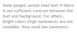
This is a low contrast page - some people might not be able to read it.
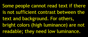
In contrast (hehehe), this is a high contrast page:
Does it mean all websites need to be in black and yellow? No!
W3C does not state exact colors that should be used. This would be horrifying.
However, they suggest a color (or as said there, luminance) contrast ratio - 4.5:1 for text smaller than 18 points and 3:1 for >18 points.
But how can we choose it? The best way is to pick contrasting colors from a color wheel. By contrasting I mean opposite ones on it.
I personally like color wheel from Adobe (unlike most of their products it’s actually free).
All right. Colorblind, dyslexic, or elderly people have no problem with our site now.
But what about those not seeing at all?
Making your site screen-reader friendly
Blind folks also use the internet. Yet instead of using eyes like us, they utilize screen readers - a tiny piece of software that reads aloud content on the page.
Sadly, those algorithms are not as intelligent as us, humans. Sometimes they might read not only the content itself but navigation, header, footer, etc.
Luckily, we can help those readers to understand our intentions and make our website even better. How?
We just need to use HTML5 semantic elements - You know, <header>, <article>, <footer>, etc.
Let’s take a look at this code:
<div id="nav">
- Element1
- Element2
- Element3
</div>
<div class="content">
<span class="text-big">Lorem Ipsum</span>
<div class="article">
Lorem ipsum dolor sit amet...
</div>
<div class="article">
Lorem ipsum dolor sit amet...
<img src="sun.jpg" />
</div>
</div>
<div class="footer">
© wizarddos 2024
</div>
It utilizes <div> and <span> elements. Both semantically poor - they’ve got no strict meaning.
The screen reader would read nav <div>, then text-big, then articles and then the footer.
In addition, instead of built-in lists, we create them on our own.
The last wrong thing I see here is the img tag without the alt attribute.
What’s alt?
It’s an attribute that contains text replacement for the image. If the picture can’t be found in that path, alt replaces it.
alt is also what’s read by screen readers.
Let’s make it better. First, we gotta replace <div> elements with HTML5 ones:
<nav>
- Element1
- Element2
- Element3
</nav>
<main class="content">
<span class="text-big">Lorem Ipsum</span>
<article>
Lorem ipsum dolor sit amet...
</article>
<article>
Lorem ipsum dolor sit amet...
<img src="sun.jpg" />
</article>
</main>
<footer>
© wizarddos 2024
</footer>
Now, let’s replace that - with an actual unordered list and <span> with the h1 element:
<nav>
<ul>
<li>Element1</li>
<li>Element2</li>
<li>Element3</li>
</ul>
</nav>
<main class="content">
<h1>Lorem Ipsum</h1>
<article>
Lorem ipsum dolor sit amet...
</article>
<article>
Lorem ipsum dolor sit amet...
<img src="sun.jpg" />
</article>
</main>
<footer>
© wizarddos 2024
</footer>
Then, add the alt attribute to the <img> tag:
<nav>
<ul>
<li>Element1</li>
<li>Element2</li>
<li>Element3</li>
</ul>
</nav>
<main class="content">
<h1>Lorem Ipsum</h1>
<article>
Lorem ipsum dolor sit amet...
</article>
<article>
Lorem ipsum dolor sit amet...
<img src="sun.jpg" alt="beautiful landscape of the sun" />
</article>
</main>
<footer>
© wizarddos 2024
</footer>
Good job. Now our simple piece is much better. Both screen readers and other programmers are happy to see it.
Time for one more thing - ARIA.
ARIA - Accessible Rich Internet Applications
As MDN says, it’s a
set of roles and attributes that define ways to make web content and web applications (especially those developed with JavaScript) more accessible to people with disabilities.
Before ever utilizing it, remember
No ARIA is better than bad ARIA.
You should for sure be using native HTML elements and constructs, rather than adding a million ARIA roles or labels.
A nice example comes from MDN themselves.
Instead of using <div> for a progress bar:
<div
  id="percent-loaded"
  role="progressbar"
  aria-valuenow="75"
  aria-valuemin="0"
  aria-valuemax="100"></div>
And then require JavaScript to keep its purpose:
// Find the progress bar <div> in the DOM.
const progressBar = document.getElementById("percent-loaded");

// Set its ARIA roles and states,
// so that assistive technologies know what kind of widget it is.
progressBar.setAttribute("role", "progressbar");
progressBar.setAttribute("aria-valuemin", 0);
progressBar.setAttribute("aria-valuemax", 100);

// Create a function that can be called at any time to update
// the value of the progress bar.
function updateProgress(percentComplete) {
  progressBar.setAttribute("aria-valuenow", percentComplete);
}
We can just use the <progress> element:
<progress id="percent-loaded" value="75" max="100">75 %</progress>
I couldn’t write a piece about accessibility without mentioning ARIA, yet it’s such a broad topic that it could be a whole series.
From here, I can refer you to the MDN docs on ARIA or the official ARIA recommendation by W3C.
Okay, we can see the page or use a screen reader to get the meaning of the content.
But what if someone does not use a mouse - like on an old laptop or PC?
No mouse? No problem! Navigating through a webpage using only the keyboard
Even though it might sound stupid, keyboard accessibility is very important.
“But, what’s the problem with using a mouse or a touchpad?”
Not everyone can use it. It’s a life-or-death situation. Either our site is keyboard-friendly or people with motor impairments, physical disabilities, or with low vision get excluded from using it.
While creating a hospital’s website, for example - it’s kind of important.
There’s a bunch of criteria we need to follow:
- Every element needs to be accessible with the keyboard
- Every focused element can be unfocused with the keyboard as well
- If it’s necessary to use another key than arrows or tab, the user has to get an applicable hint
Implementation
To know how to fix those bugs, we need to check our page first.
This step is simple, visit a webpage and try
to browse it using only the TAB key - note where something doesn’t work.
Now with this in mind:
- Reorganize your website in the most logical way possible - use
tabindexto control tab order and make elements focusable. - Ensure that the focused element is always even a bit visible to the end user. You can always change the outline with CSS, for example, to match the contrast ratio.
:focus { outline: 5px solid cyan; } - Try out all drop-downs - See how you can navigate through them, if every element is accessible and if it isn’t too long.
Time to jump into the last part of our little course.
Transcripts and subtitles - Our gifts for people hard of hearing
I think most of us are familiar with transcripts - It’s a text version of recorded speech (like a podcast or a video).
This, and famous subtitles, are a great way to include deaf people in our community.
The best, according to W3C, is to have both transcripts and subtitles.
Remember - They should identify every dialogue speaker and most of the sounds like door opening or footsteps.
Transcripts should be put closely to the video/audio.
Conclusion
That’s it for the article! I hope you’ve enjoyed it.
There wasn’t much going on, as I was focused more on my YouTube channel. I’m just wondering - should I create a separate channel for IT stuff and stay with this one only for cybersec? Or maybe having only one channel is a better option?
Share your ideas. Right now, thanks a lot for reading my piece.
Check out other articles like these:
- 5 Less-Known HTML Tags You Should Be Using
- Quick intro to React
- Cookies and “Remember Me”: A Guide to Secure Implementation in PHP
If you want to support me - check out my Patreon too.
That’s really about it. See you next time.
Sources: